


Purpose: On-boarding design is the central part of the design. It’s the first experience after downloaded. The purpose is to show users the value as soon as possible.
Role: User Research, UX Design, UI Design and Prototyping
EasyTrain
Project
Why do people need EasyTrain?
EasyTrain is concept APP which is used by connecting trainers and people who find trainers.
EasyTrain is concept APP which is used by connecting trainers and people who find trainers. As a concept, I have to make sure there is a market for the concept. A survey is a good way to analyze people’s needs. The sample size is around 100. Questions in the survey are about their needs and thoughts about the physical trainer.
numbers
of people have unsatisfied needs for a trainer.
of people think trainers are helpful for their training.
67%
83%
insights
What do you think about the physical trainer?
“I used to have one. I can’t afford it for a long time.”
“They are very helpful. I recommended every starter to find a professional trainer.”
What will you concern mostly if you are using this APP?
“Safty. I need them come to my house. Safty is the priority.”
“I don’t want to get training from people who have no idea what they are doing. I need an experienced trainer.”
What do think about EasyTrain?
“It’s like the Uber for people who want to be a trainer. Love it. I will be part of it.”
“I may earn some money from that.”
Competitors
According to my research, there are two websites which offer the same service. They help users to find a trainer, mostly for strength training and aerobic exercise.


Advantages
Much more exercise types
The only one for mobile
Users can chat with trainers
Filter is more powerful
......
wireframe
Users may decide whether they are going to continue using the APP for 30 seconds after the first open. The key is to let users feel the value of the APP. If users can’t feel it, they will delete the APP and never use again. In my design, I try to find out the fastest way to show value to users.
How to make users love this APP?
Put APP value on the first screen. Users can know better about the APP.
Users choose once at one screen. No pressure at all.
Users choose once at one screen. No pressure at all.
The floating button is one of the options.
Option 1
Filters are hidden behind the header. They will appear when users scroll down.
Pro: more space for information
Con: unconvenient for filter
Option 2
Filters are on the top and fix on top when users scroll down.
Pro: good balance of information and filter
Option 3
Filters are on the top and fix on top when users scroll down.
Pro: easy to active filter
Con: float button affect information reading
content
filter
filter
content
filter
content
Option 1
Pro: high priority for pictures
Con: no introduction for users
Option 2
Pro: more information for users
Con: low priority for pictures
The standard process is sign-up, set filter and get information. But the standard provides value slowly. Users can't feel it immediately, and they won't sign up with their easily. So I improved the standard. In the new design, users can directly set up the filter and get information before sign-up.

user flow
more iteration for the page
final version

‘Use GPS’ has higher priority which is convenient for users.
List all exercises. So users can choose easier.
All buttons on top are belonged to filter system. Floating button affects information reading.
Arrange informations according to users’ needs.
Option 3
Each rectangle means every day' time. Red parts are selected time.
Pro: select precise time, overview for all days
Option 2
Users slide over squares to select time arrangement.
Pro: overview for all days
Con: can not choose time
Option 1
Users can choose time by sliding circle button on everyday.
Pro: select precise time
Con: no overview for all days

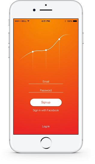
Red, orange are main colors for this UI design. Because they give people the impression of sport and energetic. Color strategy is based on red and orange. These colors are for all products which related to this APP, like advertising.
